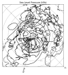
I'm plotting WRF output on a NH polar stereographic domain using wrf-python on CISL/NCAR's jupyterhub. I keep getting artifacts that look like latitude circles when I try to plot my output based on available plotting examples. Code has been pasted below. Any insights? I wanted to try using geocat to see if that helped, and I can't find an NPL that has both wrf-python and geocat together.
Thanks in advance for any help!
from netCDF4 import Dataset
import matplotlib.pyplot as plt
import matplotlib as mp
import cartopy.crs as crs
from cartopy.feature import NaturalEarthFeature
import os
from wrf import (to_np, getvar, smooth2d, get_cartopy, cartopy_xlim,
cartopy_ylim, latlon_coords)
# Open the NetCDF file
#use this when plotting from your team members' directories as the paths
#are too long
loc = "/glade/derecho/scratch/nfigueira/wrfout2/"
ncfile = Dataset(os.path.join(loc, "wrfout_d01_2021-02-08_23:00:00"))
# Get the sea level pressure
slp = getvar(ncfile, "slp")
# Smooth the sea level pressure since it tends to be noisy near the
# mountains
smooth_slp = smooth2d(slp, 3, cenweight=4)
# Get the latitude and longitude points
lats, lons = latlon_coords(slp)
# Get the cartopy mapping object
cart_proj = get_cartopy(slp)
# Create a figure
fig = plt.figure(figsize=(12,6))
# Set the GeoAxes to the projection used by WRF
ax = plt.axes(projection=cart_proj)
# Download and add coastlines
ax.coastlines('50m', linewidth=0.8)
# Make the contour outlines and filled contours for the smoothed sea level
# pressure.
plt_slp = ax.contour(to_np(lons), to_np(lats), to_np(smooth_slp), 10, colors="black",
transform=crs.PlateCarree())
# Set the map bounds
ax.set_xlim(cartopy_xlim(smooth_slp))
ax.set_ylim(cartopy_ylim(smooth_slp))
# Add the gridlines
gl = ax.gridlines(draw_labels=True, color="black", linestyle="dotted")
gl.right_labels = False
gl.x_inline = False
gl.top_labels = False
plt.title("Sea Level Pressure (hPa)")
plt.show()

